With shops soon reopening and online retail sales at an all-time high with reports showing a growth of 74% in January 2021 compared to the previous year, Mr Lender wants to help you become a savvier shopper and let you know how retailers attempt to entice you to spend more than you intend. This is because retailers know how to attract customers into their stores and online websites by using a number of different techniques engineered to get you to part with your money.
RETAIL SHOPS – COLOUR
Retailers use colour in a variety of different ways in order to subliminally appeal to our senses. The red in restaurant logos attempts to trigger a feeling of hunger, and retail shops will try to use rosetint in the mirrors of the fitting rooms to make you look more attractive. But every colour is used to spark a different feeling or sensation. 80 percent of information that reaches our brains is via our eyes, so it means that we are instinctively more comfortable when colours remind us of something familiar. Yellow — Grabs attention |
|
RETAIL SHOPS – THE POUND SIGN
Studies have shown that customers are more likely to spend their money on items that don’t include the pound sign on the price tag compared to those that do, or even if they have the price written out in words. Also, items with the price tag ending in either a ‘9’ or an ‘8’ makes the customer feel like they are getting a deal, items that end with ‘00’ creates the impression of a higher quality product, and tags that end with random numbers look as though they have been reduced down as low as possible. Shops will usually group items that are similar in threes, with three different price ranges, low, medium and high. This creates the illusion that you’re getting a better deal with the mid-priced item compared to the more expensive one and you’re getting better quality compared to that of the lower priced item. |
|
RETAIL SHOPS – LAYOUT
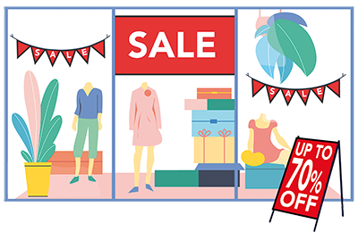
It’s a well-known fact that supermarkets place staple items such as milk, bread, and eggs at the very back of supermarkets in order to make customers pass everything else in the store in an attempt to entice them in to buying things they didn’t originally need. The same ideas are used in retail. Socks and underwear are usually at the back of the shop or on another floor, and items that are usually bought at the same time are positioned as far apart from one another as possible. Escalators are usually positioned in such a way that in order to navigate between different floors you have to go all the way round to the other side of the shop passing everything the shop has to offer to find them. There is even a theory that the direction of your journey around a shop can influence your spending, by making customers move counter clockwise around a store they are put into a sense of ease and are in less of a hurry to leave. Sale items that have had prices slashed are placed at the front of the shop in order to draw customers in that originally had no intention of going in, it is easy to notice a large red sign saying “sale” or “reduced” in the window that makes you want to find out more and before you know it your basket is full! |
|
RETAIL SHOPS – CHANGING ROOMS
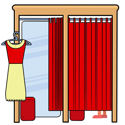
Obviously one of the biggest advantages of shopping in an actual retail store is you get to try items on before you purchase them. But the whole experience of trying on things in changing rooms is an opportunity for retailers to manipulate all of your senses into making you feel great about the way you look in the item you are wearing. The reason why some retailers opt for curtains instead of doors in changing cubicles is to emphasise your vulnerability of not being within secured surroundings. This creates a more rushed judgement on outfits instead of taking the time to take it all in at your own leisure. Some retail shops don’t have mirrors in the changing room itself but instead just outside it, almost forcing you to interact with a member of the sales team to compliment you or upsell various other items that would complete the look. A lot of shops have very few mirrors on the floor forcing you to go to a changing room. Lighting is crucial to enhancing a customer’s appearance, some retailers use colour filtered light bulbs in order to make your skin colour look more flattering. Or big vertical lights either side of a mirror make you look evenly lit and slimmer since the light brightens your face and body. But the biggest trick is the angle of the mirror, dressing room mirrors are known to be tilted, so the bottom is closer to the customer than the top creating an illusion that you are taller and skinnier.* *Please make sure you adhere to any government guidelines in place at the time of publication |
|
ONLINE – THE POUND SIGN
By far one of the most profitable tactics retailers use is ‘free delivery or shipping’, by offering spending thresholds of free shipping when you spend over £35, or next day delivery on orders over £75. Consumers will more often than not add to their order to reach these thresholds with things that they don’t initially want or need. The same logic applies to when retailers offer £5 off when you spend £50, or £10 off when you spend £100, it creates the illusion that the more money the customer spends the more they are saving but at the end of the day it is usually the retailer that comes out on top. Websites often use ‘dynamic pricing’, in which they will set flexible prices on products and alter them on the fly in response to consumer and market behaviour. These ‘dynamic pricing’ changes are automated by software agents altering pricing according to business rules, taking into account factors such as: |
|
ONLINE – WEBSITE LAYOUT
A retailer’s website layout is crucial in enticing customers and retaining their interest for as long as possible, but they are in some cases designed to get you to spend more money than you intended to. Just like in the checkout aisles of shops, retailers conveniently place bargain bin items at the checkout process – things such as suggested items, or what “people who bought this item also bought”. Whereas retail shops attempt to make you travel long distances to navigate your way through the many aisles to get to a checkout, online retailers try making your transaction as quick as possible. They do this by asking you to create an account, this helps in speeding up any future purchases you make, without the need for inputting your billing, delivery, or credit card information every time, giving you less time to mull over your purchase and preventing any second thoughts. The first few products you see on an online retailer’s website are normally what’s perceived as being the most popular items at that moment in time, but more often than not retailers are attempting to move stock that they have the strongest need to get rid of. |
|
ONLINE – BASKET
Once you have all of the items you intended on buying in your virtual basket you think to yourself, “that’s it, I’m on the home stretch, nothing to deviate me from my original purchases now”. But if anything, this is when retailers try one last ditch effort to present you with offers and discounts to get you unknowingly spending more. Sometimes they will create a time limit in which they will hold items within your basket, creating a sense of urgency so as to not lose the items you have been scouring across the website for and creating a call for action, not allowing for any time to reconsider your purchases. Some retailers that allow you to keep products within your basket for as long as you want whilst you ponder over whether you truly need them will send you emails when they see you’ve abandoned your basket. You are presented with something along the lines of ‘get 10% off your item if you complete your order’ again creating a sense of urgency as to not miss this new fantastic offer. A lot of retailers at the moment are offering “buy now pay later” schemes which can create an illusion of affordability. (for more information about “buy now pay later” check out our previous blog here). |
|
ONLINE – TARGETED ADS
The tactic of retailers tracking your online search history and targeting adverts towards customers was once a subtle art, but these days is much more obvious and in your face that you almost can’t escape them; even if you’re just trying to check the weather, you will probably see a few adverts for t- shirts you looked at over the past few days. Constantly seeing that product you have been mulling over for a few weeks makes you think how many times are you willing to turn down the opportunity to buy something that you like? Once they have an insight into your search history, retailers start to build a profile of you, and they make assumptions about your buying habits. Age, gender, income, relationship status: advertisers will take whatever they can get if it means they could sell you something. They can even follow you across various devices. Advertisers can now guess who you are by analysing your location, browsing habits, and the types of sites you sign in to, like Facebook or Google. |
|
|
|
|
![]()
Mr Lender is a multi-award winning lender and is rated five stars on Trustpilot by customer reviews. So why would you choose anyone else for your short term loans?


